Quick Start
Table Of Contents
This guide will introduce you to how MahApps.Metro works and how to incorporate it into your app.
Installation
You can install MahApps.Metro via the NuGet GUI (right click on your project, click Manage NuGet Packages, select Online and search for MahApps.Metro) or with the Package Manager Console:
Install-Package MahApps.Metro
If you want to use the pre-release packages of MahApps.Metro (these have the latest code and newest features), you need to enable Include Prerelease in the GUI:
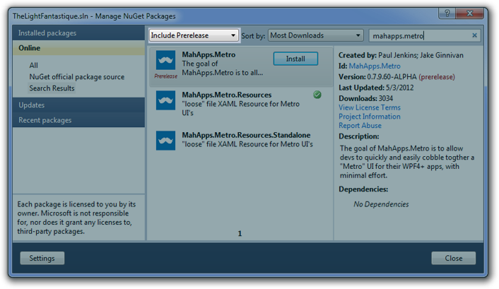
or use the Package Manager Console:
Install-Package MahApps.Metro -Pre
Styling the Window
There’s two ways you can style your Window using MahApps.Metro:
- You can use the included
MetroWindowcontrol or, - Design your own window
For now we’ll use MetroWindow, as this approach will work for a good percentage of apps and is the quickest and easiest way to get going. If you want to learn about rolling your own window, check out the guide.
Using the MetroWindow Control
Modifying the XAML file
After installing MahApps.Metro:
- open up
MainWindow.xaml - add this attribute inside the opening Window tag. (It’s how you reference other namespaces in XAML):
xmlns:Controls="clr-namespace:MahApps.Metro.Controls;assembly=MahApps.Metro"
or
xmlns:Controls="http://metro.mahapps.com/winfx/xaml/controls" - change
<Window ...tag to<Controls:MetroWindow ...(remember to change the closing tag too!)
You should have something like this (don’t copy and paste this):
<Controls:MetroWindow x:Class="WpfApplication.MainWindow"
                      xmlns="http://schemas.microsoft.com/winfx/2006/xaml/presentation"
                      xmlns:x="http://schemas.microsoft.com/winfx/2006/xaml"
                      xmlns:Controls="clr-namespace:MahApps.Metro.Controls;assembly=MahApps.Metro"
                      Title="MainWindow"
                      Height="600"
                      Width="800">

  <!-- your content -->

</Controls:MetroWindow>
Modifying the CodeBehind File
You’ll also need to modify the MainWindow.xaml.cs file so that the base class for MainWindow matches the MetroWindow class of the XAML file.
// To access MetroWindow, add the following reference
using MahApps.Metro.Controls;

namespace WpfApplication
{
  public partial class MainWindow : MetroWindow
  {
    public MainWindow()
    {
      InitializeComponent();
    }
  }
}
But in most cases you can just drop the base class (because this is a partial class the XAML should take care of this):
namespace WpfApplication
{
  public partial class MainWindow
  {
    public MainWindow()
    {
      InitializeComponent();
    }
  }
}
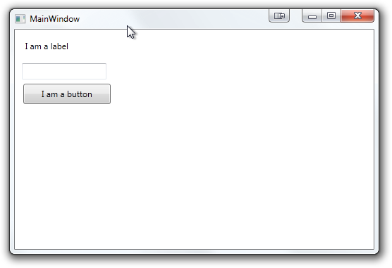
The end result will look something like this:
Using Built-In Styles
All of MahApp.Metro’s resources are contained within separate resource dictionaries. In order for most of the controls to adopt the MahApps.Metro theme, you will need to add the ResourceDictionaries to your App.xaml.
App.xaml
<Application x:Class="WpfApplication.App"
             xmlns="http://schemas.microsoft.com/winfx/2006/xaml/presentation"
             xmlns:x="http://schemas.microsoft.com/winfx/2006/xaml"
             StartupUri="MainWindow.xaml">
  <Application.Resources>
    <ResourceDictionary>
      <ResourceDictionary.MergedDictionaries>
        <!-- MahApps.Metro resource dictionaries. Make sure that all file names are Case Sensitive! -->
        <ResourceDictionary Source="pack://application:,,,/MahApps.Metro;component/Styles/Controls.xaml" />
        <ResourceDictionary Source="pack://application:,,,/MahApps.Metro;component/Styles/Fonts.xaml" />
        <ResourceDictionary Source="pack://application:,,,/MahApps.Metro;component/Styles/Colors.xaml" />
        <!-- Accent and AppTheme setting -->
        <ResourceDictionary Source="pack://application:,,,/MahApps.Metro;component/Styles/Accents/Blue.xaml" />
        <ResourceDictionary Source="pack://application:,,,/MahApps.Metro;component/Styles/Accents/BaseLight.xaml" />
      </ResourceDictionary.MergedDictionaries>
    </ResourceDictionary>
  </Application.Resources>
</Application>
Make sure that all file names are Case Sensitive!
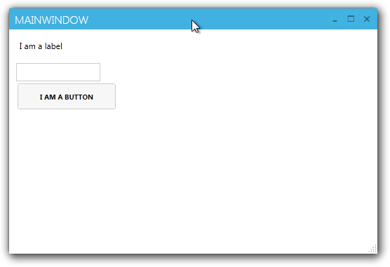
The end result will look something like this. If you want to know more about how the control works, more information can be found below.
What’s a MetroWindow?
The default MetroWindow is made up of a few components:
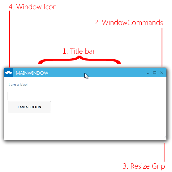
If you don’t like the elements that are labelled, fear not, they’re all optional.
- The titlebar is what sets
MetroWindowapart from rolling your own.ShowTitleBar="True|False" - The resize grip is not the only way to resize a
MetroWindow- all edges and corners can be gripped, but given aMetroWindowdoesn’t have a noticeable window “chrome” like an aero window, the resize grip can help reassure users. - Instead of using static images, the icons for minimize/maximize/close are a font called Marlett. To explain why this is so requires a walk down memory lane, or at least a visit to the Wikipedia article about it.
- You can even hide the icons on the title bar by setting the
ShowIconOnTitleBar="True|False"
Customization
WindowButtonCommands
WindowButtonCommands are the minimize, maximize/restore, and close buttons. You can hide the buttons with ShowMinButton="True|False", ShowMaxRestoreButton="True|False" and ShowCloseButton="True|False".
The visibility of the minimize and maximize/restore buttons are also effected by the ResizeMode. If ResizeMode="NoResize" the buttons are collapsed. If ResizeMode="CanMinimize" the maximize/restore button is collapsed.
(Left-/Right-) WindowCommands
You can add your own controls to LeftWindowsCommands or RightWindowsCommands - by default, buttons have a style automatically applied to them to make them fit in with the rest of the WindowsCommands. As of 0.9, you are no longer limited to just buttons, but any control. Be aware, you’re responsible for styling anything other than buttons.
Including this within the <MetroWindow> ... </MetroWindow> tag:
<Controls:MetroWindow.RightWindowCommands>
  <Controls:WindowCommands>
    <Button Content="settings" />
    <Button>
      <StackPanel Orientation="Horizontal">
        <Rectangle Width="20"
                   Height="20"
                   Fill="{Binding RelativeSource={RelativeSource AncestorType=Button}, Path=Foreground}">
          <Rectangle.OpacityMask>
            <VisualBrush Stretch="Fill" Visual="{StaticResource appbar_cupcake}" />
          </Rectangle.OpacityMask>
        </Rectangle>
        <TextBlock Margin="4 0 0 0"
                   VerticalAlignment="Center"
                   Text="deploy cupcakes" />
      </StackPanel>
    </Button>
  </Controls:WindowCommands>
</Controls:MetroWindow.RightWindowCommands>
Make sure to include the icons to get the cupcake.
Produces this window titlebar:

The foreground (link) colour of (Left-/Right-) WindowCommands will always be white, unless the titlebar is disabled, in which case it will be the reverse of whatever theme you have selected. For example, using the White/Light theme, the foreground colour will be black.
What’s Next?
For extended documentation, take a look at the Controls page